A more interactive approach to measuring team satisfaction
For some time now, I’ve been thinking about checking my team’s satisfaction in a way that would be a bit more scientific than using the best method ever, called “just talk”, or collecting information from individual people via one-on-one sessions. In the past, I used to conduct satisfaction surveys — with quite a good effect. However, this time I wanted to go further and make this exercise more interactive and closer to people. I was hoping to achieve more responsiveness, more honesty and more openness than in the case of a regular online/email survey. While looking for a more interactive method, I came across Spotify’s Squad Health Check, an interesting tools which I decided to experiment with.
NOTE: The method is based on physical meetings, but there are easy ways to conduct these procedures online, which I describe at the end of this article – so don’t worry, you’ll be able to make use of it even working from home!
What is it all about?
You can understand the Health Check as a replacement for satisfaction surveys or even classic maturity models. It attempts to respond to a question: “how is the team doing?” What is important here — it’s not about grading, comparing, progressing through levels (like in the case of classic maturity models) — it focuses on the team, and the main audience of this method is the team. Team (or Squad in Spotify terms) Health Check is a systematic approach which helps visualize ‘health’ of the team covering multiple areas like: teamwork, learning, speed etc.
When should we use it?
As I mentioned above, there are multiple areas where this approach may be useful.
- You can treat this as replacement for satisfaction checks — it’s more interactive and definitely more fun than online/email surveys. Areas for improvements and ideas how to improve them also surface in a more natural way — during discussion
- You can also perceive this as an interesting element of Agile maturity model. Default selection of areas to discuss covers a decent portion of areas of agility. There are no levels, no progression but if you collect information from multiple teams across your working group or organization, you will get current ‘state of play’ in quite an easy and natural way.
- You can also use this as approach for retrospective sessions. In fact, it’s different than a standard scrum retrospective, it does not focus only on the last sprint, and areas for discussion are described in advance.
Why use it?
Here are some compelling grounds for using the approach:
- it build self-awareness within the team
- it facilitate the Agile inspect-and-adapt loop
- it will let you learn more about the current state of Agile in the team/organization
- you will be able to spot issues earlier and figure out improvement points together
- it expands the team’s perspective
How to use it?
Preparations
You will need the following resources to play our game:
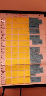
- whiteboard or flipchart — I do prefer flipchart, since after all is done you can take the paper sheet with you and for example place it in a visible place in your project/team room
- printed version of areas (along with example of awesome/crappy) and traffic lights (you can download from here https://spotifylabscom.files.wordpress.com/2014/09/squad-health-check-model2.pdf)
- markers and pens
- sticky notes
- time 🙂 — around 2 hours
Plan vs reality
My initial plan was to go through the following steps:
- Intro
- Gather data — voting for categories using traffic lights cards
- Generate insights — talk about each of the results and discuss specific insights
- Work on improvement points
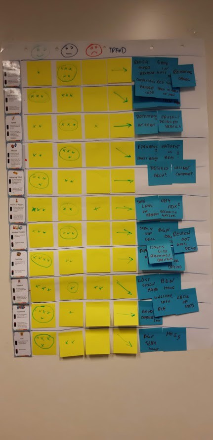
The reality was a little bit different and during the course of discussions, points 2–4 (in vast majority 2–3) were mixed together and we had to dive deeper into discussion on specific points while trying to resolve diversity of opinions and disagreement on specific areas. In my opinion, this is not a bad choice and it’s a good sign that discussion emerges naturally. I don’t think that following a plan by all cost is a good choice here. Sometimes it is better to go with the flow!
Collecting the data
Health check provides us with the ability to discuss a set of pre-defined health indicators. The default set consists of 11 areas, but the team can add and remove areas as per their needs. To facilitate the discussion, we can use deck of “awesome cards” — each card has “example of awesome” and “example of crappy” for given area/category.
Let’s have a look at sample deck:
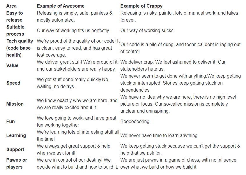
For each question, the team is asked to decide if they are closer to awesome or crappy. We used “traffic lights” cards and the team voted similarly to planning poker. In case of disagreement, we discussed each point further and were seeking for a common ground. We also discussed the trend — if it is stable, getting better or worse…
As for definitions of each “light”, we followed more or less this one:
– Green — not perfect (it’s never perfect) but team is happy with this
– Yellow — not a disaster, despite some points for improvement
– Red — very bad situation, things need immediate improvements

As I said above, in many cases there were a lot of discussions emerging from voting. You will get lots of immensly valuable insight generated during seeking for consensus on a color, as well as when evaluating the trend for each area.
Work on improvement points
You will potentially get lots of areas where some improvement is needed, as well as lots of ideas on how to improve. Generally, I would suggest following the “baby steps” principle and not getting too wild in committing to improvement points. It might be a good idea to vote on most important areas to improve (let’s say — select two areas) and choose the best ideas only for two selected categories.
How often should we repeat this exercise?
The whole exercise is pretty demanding and requires a few hours of involvement from all team members. I think it’s good idea to start with repeating this every 1–2 months.
How to do this online?
Ok, but how to do this when you’re working from home? There are several tools available on the web but you can go wild and create your own solution fully tailored to your needs. If it comes to tools available on the web you can use for example:
This tool supports the method in its vanilla type. You can go through configuration of categories and examples and publish to other participants using generated “sharing link” or QRCode. Once everybody votes in all categories, the system will automatically calculate results and display them to everybody. The tool is very simple and looks great, but you are not able to go one by one and discuss categories before submitting final results. The system calculates it automatically so you are not able to adjust the results after discussion. In my opinion, it reduces the importance of discussion a little bit.
This tool is part of the Team Retro platform which offers a lot more retros and team satisfaction formats. The tool look nicer and more professional than the previous one – but you have to pay for it. Results are displayed in a “radar” format which is not fully in line with the original version of the method. This type of representation resembles more sophisticated maturity models. Similarly to previous one, results are calculated automatically and you are not able to adjust results after a discussion.
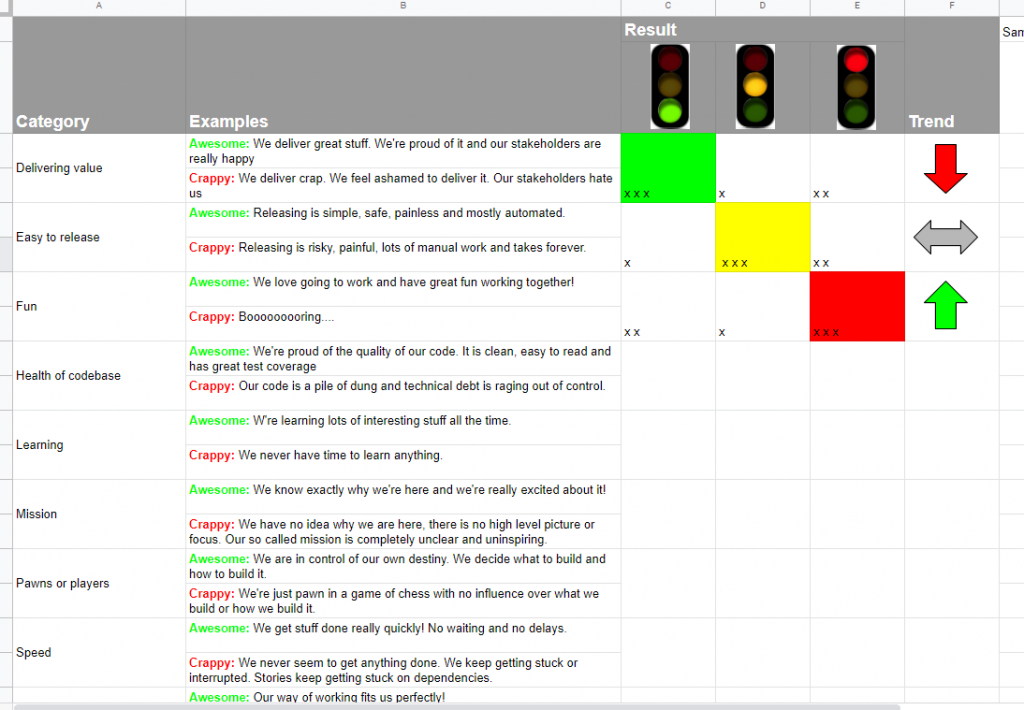
- My home grown solution
I would like to present you with my home grown solution which I prepared using google docs. It’s not as nice and sophisticated as the other apps. It’s not an app at all. This is just a very simple spreadsheet that supports the discussion you want to have with your team. The document is publicly available, so please feel free to copy and use it in your work.
For voting, you can use multiple ways as well:
- simple approach — all participants show “traffic light” cards to their webcams — simple sticky notes in green, yellow and red color will work as well,
- “techie” approach — use one of the customizable voting platforms. I experimented with a platform for planning poker called Pokrex. You need to create your own voting scheme that covers the colors you plan to use, as well as write down all areas as elements to vote against. Sample voting room on Pokrex is available here (please do not edit or work on this — it’s more for inspiration).
Wrapping up…
Me and my team found this approach very interesting and useful. According to my teammates, it is better than online or email surveys. It allows to extract more honesty and openness from the team side.
Some final tips and tricks:
- if you have multiple teams — do not try to compare them. This tool is not designed for comparison and attempt to compare teams based on results will lead to a situation when the whole approach will fall apart.
- make sure you explained your rationale behind the method. Team need to understand and agree on why this exercise is undertaken. You need to emphasize that the whole model is about learning, self-awareness and improvement, not about judgement and comparisons!
- do a follow up — both on action points, as well as on how the approach is useful. Make sure that this is still helping the team to improve. Avoid following it blindly just for the sake of the effort you put into introducing the exercise.
References
- Original idea described here: Squad Health Check model — visualizing what to improve
- Squad Health Check as retrospective: My experience with Squad Health Check as a Retrospective format
- Health checks for teams and leadership: Health checks for Teams and Leadership